
The history of Yamato cutaway art
If you’ve already read the article entitled Yamato Design Evolution, it should come as no surprise that the constant tinkering, modifying, and revamping wasn’t limited to the outside of the ship. Leiji Matsumoto’s love of detail ensured that Yamato’s interior would be worked out with as much technical precision as its skin. Every youngster who has stared transfixed at a cutaway drawing of a mechanical object (real or imaginary) inherently understands the fascination of hidden internal workings. (Besides, it was rather important to determine where things were located for the sake of story continuity.) Interior diagrams of Yamato have provided otaku-fuel since long before the word assumed its modern meaning. What may come as a surprise, however, is the sheer number of interior diagrams that have been published over the years, almost none of which entirely agrees with the others. Here is a comprehensive look at how Yamato has evolved from the inside out.
The very first interior view (at left) was published in the 1974 “pitch book” that sold the Yamato TV series to the Yomiuri network in Japan. Based on a pure-profile animator’s model sheet, it depicted diagrams for both the World War II and the new anime version. This artwork had a long shelf life, appearing on dozens of Yamato products such as a pencil board (at right) that was released with the 1977 movie and features English text. Click on the image above to open an enlargement of the pencil board.

Music publisher Nippon Columbia was among the many Yamato licensors who utilized this art in 1977. It appeared in the foldout of the first Space Battleship Yamato drama LP (above) and again in one of the many promotional posters Nippon Columbia released throughout its heyday (below). This is also one of the earliest examples of English text appearing on a mass-market Yamato product.
Click here to view an enlargement.

The single biggest version of this diagram was very creatively published in the 1982 Yamato wall calendar (ad shown below left). Each of its 14.5″ x 20″ sheets was printed with color paintings on one side and black & white animation designs on the back. The diagram was enlarged and tiled onto five of these sheets which stretched for six feet when lined up end-to-end. The most recent reproduction of the original diagram is shown below right, reproduced from the March 2007 issue of Dengeki Hobby Magazine. Over 33 years after its creation, this piece is alive and well.
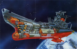
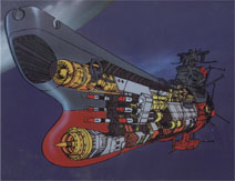
In the wake of Farewell to Yamato in 1978, a painted version of this diagram (above) was commissioned for use on new products. It faithfully preserved every detail of the line drawing, whether or not it still matched what was seen in the animation (there was, for instance, no evidence of any fightercraft stored under the forward deck). This painting appeared endlessly on one product after another, especially during the 1980 Be Forever campaign.

One more profile painting appeared in the Yamato 2 Roman Album, published in March 1980. It was the one and only time this particular piece was used, a “Perspective Illustration” foldout by an artist named Hitoshi Ikematsu whose also did paintings for JAXA and textbooks on space exploration.
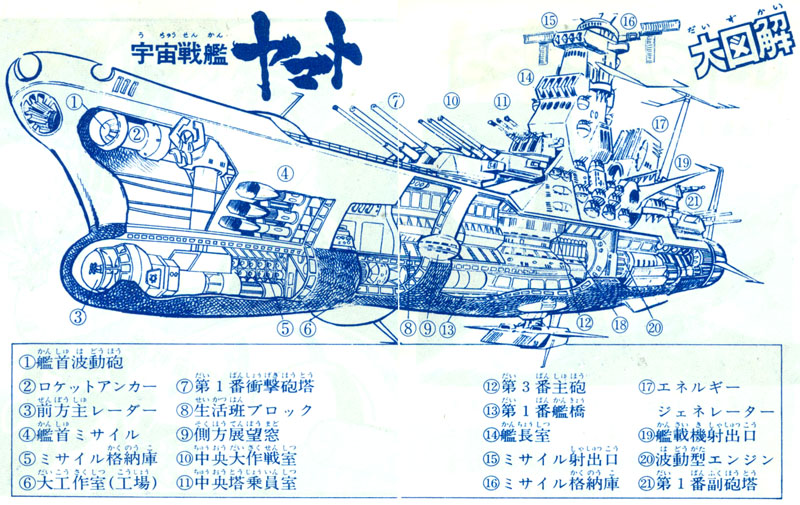
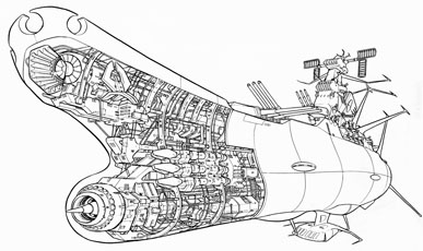
The second interior view had the same vintage as the first. The original illustration was absolutely exquisite in its level of detail and served as a basis for a partially-colored version that appeared in the center spread of the 1974 TV “pitch book” (below).

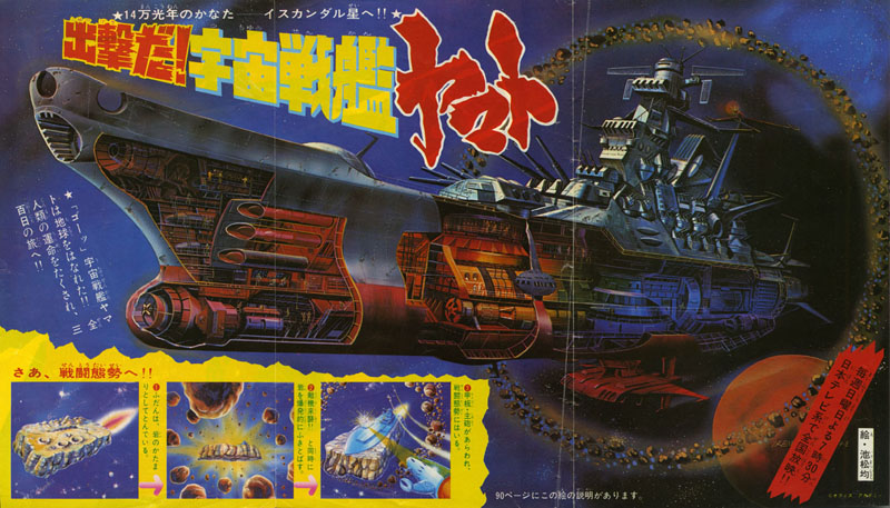
The first time the general public saw this image in print was when it trumpeted the arrival of Yamato to the pages of Terebi [TV] Land magazine. Beginning with the November 1974 issue, exclusive color art and a full-blown manga version by Yuki Hijiri were featured in every issue through the following March. This version of the 3/4 cutaway view was masterfully painted by Hitoshi Ikematsu, and his dating of August 5, 1974 means he did his work a good two months before the series went on the air. Strangely enough, this was also the first place anyone outside the production unit saw the earlier version of Yamato as a giant space rock.
Click here to see a “clean” version of this amazing piece, and visit our Quest for Iscandar gallery for more of the one-of-a-kind art that was published in Terebi Land.

This variant version of the cutaway painting by artist Toshio Okazaki was only ever seen in print once, in the March 1979 issue of Terebi kun magazine.
Since quality control wasn’t yet as heavily enforced as it would be in later years, not every Yamato product that accompanied Series 1 was entirely consistent with official production materials. This art from a stationery set by Showa Note was obviously cribbed from the model sheet, but got a few details wrong. Nevertheless, it was a huge advancement over the sort of art normally associated with children’s merchandising and was a strong indicator of what would come next.
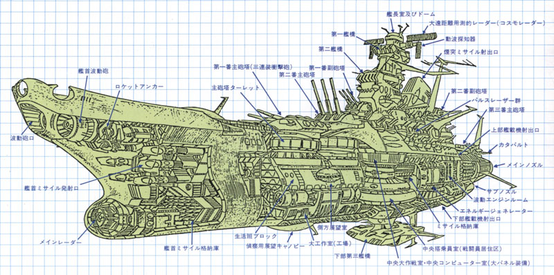
This later version went back to the original illustration and added text callouts for publication in a book.

One more piece from the early years was this one, drawn during the production of the first TV series. Whereas the first two versions could sustain a fair amount of “made up” detail for the sake of visual interest, this one was purely functional. It was rendered specifically to work out how characters could get from one section of the ship to another so directions of travel could be consistently depicted in the storytelling.

In December 1974, just over two months into the run of the first series, the very first Yamato art book appeared in stores, an illustrated children’s book by mecha design powerhouse Studio Nue. Full of lurid, imaginative paintings that represented an as-yet-untamed version of the story, the book’s highlight was a full-color foldout containing yet another cutaway painting. This one used the same animator’s drawing that was the basis for the “functional” drawing, and has never been reprinted. See the book from cover to cover here.
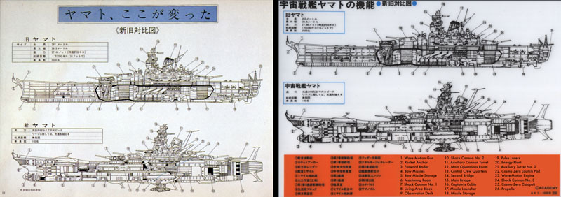
The next diagram to be officially published appeared in 1979 as a line drawing (left) in a Yamato 2 book from Shogakukan. It was designed very closely after the second diagram but updated with a larger wave-motion gun. A fully painted version (right) appeared just a month later in a book about Farewell to Yamato. This was the second of two ‘cel collection’ books published by Shonen King, which also contained a completely different version (below left) accommodating to the ship’s silhouette as seen in Farewell to Yamato publicity art.
Click on each of these images to view an enlargement.
One might think that after all these images had come and gone, there would be little need for more. But as the 1980 premiere of Be Forever proved, the world of Yamato still had many levels to explore.
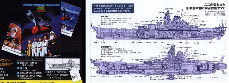
All the standards were higher now, and the next three diagrams went a long way to demonstrate just how much. The first (right) appeared on the cover of the Yamato 2 Roman Album, published by Tokuma Shoten in August, 1980. The second (below) came out a month later, in the Be Forever blueprint collection from Asahi Sonorama. This rendering was credited to artist Yuji Hirata, and would be presented again in 1983 as a bonus foldout in the American Space Fanzine Yamato.
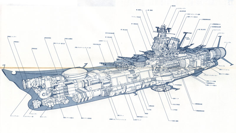
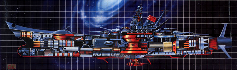
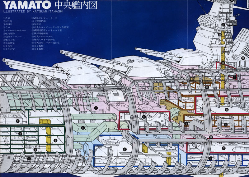
The amazingly intricate piece below appeared just a month after the blueprint collection within the pages of Tokuma Shoten’s Be Forever Roman Album. All three of these 1980 diagrams reflected great credit on the skills of the artists and the level of precision Yamato now demanded.
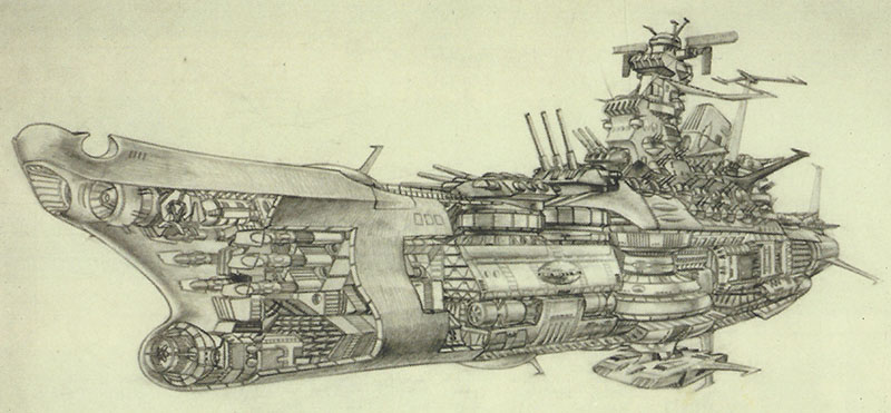
Though not pictured here, artwork of equally high quality appeared in Office Academy’s groundbreaking “silver books” devoted to the first TV series. Published in the summer of 1978, these amazing hardcovers included multi-page foldouts that had been commissioned from Japan’s Mori Art Studio.

The “Mori Yamato” made its appearance in only two known places: the September 1978 edition of Japan’s Playboy magazine (above) and a book that was published shortly after the 1983 premiere of Final Yamato, a special from Animec magazine (below). The Animec version made it evident that Mori Art Studio went beyond internal details to graph out the contours of the hull itself.

If you’re wondering why any studio would go to such lengths, it’s because these weren’t merely drawings made to entertain; they were blueprints for a very large display piece called the “Precision Cut Model” that has made numerous public appearances since it was built in 1978. Keep reading to learn more about it.

Naturally, the internal workings of Yamato would not be limited forever to the printed page. Bandai was the first to bring them into the three-dimensional world in 1978 with their unique 1/700 scale Yamato “mechanic model,” (above left) which was closely constructed on the first internal diagram from 1974. Modellers could build all the internal workings, which were then revealed by pulling off one side of the hull. Banpresto, a toymaking subsidiary of Bandai, released a “light-up mechanical model” in 2000 (above center) that followed in the model kit’s footsteps with a whimsical “super deformed” version. Another Bandai subsidiary called Megahouse made a cutaway Yamato part of its third “Cosmo Fleet Collection” in fall, 2007 (above right).

Yamato jumped into the virtual world of 3D CG when Japan’s NEC Interchannel released an amazing product called the Master Edition CD-Rom in spring, 1999. For the first time, fans could wander selected areas of the ship through a clever combination of Quicktime movies and interactive virtual sets. (The image above is from the CD-Rom’s instruction manual.) As with all software of the period, it soon became outdated and it was rather limited even when measured against first-person walkthrough games from the same era. But the enjoyment factor is compromised not one bit by technical concerns. By all accounts, the Master Edition CD-Rom is an outstanding production, and it can be examined in full here.

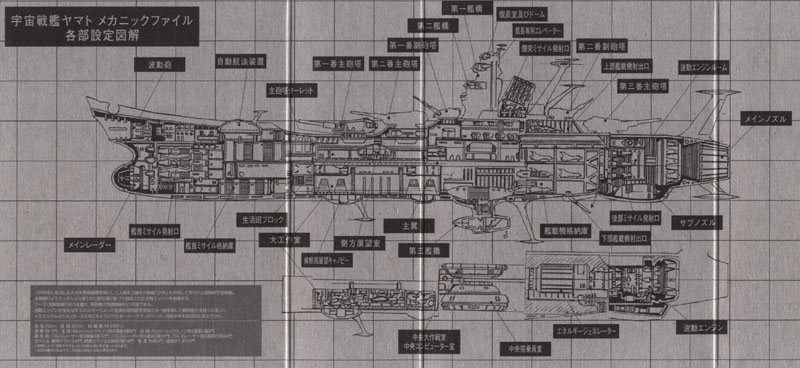
Returning to the world of hands-on models, we come to Bandai’s impressive “Mechanic File,” (above) which was rolled out in 2005. Measuring over a foot long when completed, it is comprised of 8 subsections, each one a 3-D puzzle of such intricacy that even the main bridge requires assembly. Fittingly, the model comes with an internal diagram of its own, (below) clearly based on the very first internal drawing, but updated to match the kit itself. A close comparison of the two reveals much that is different, but much more that demonstrates how much of the original concept remained intact through so many interpretations.
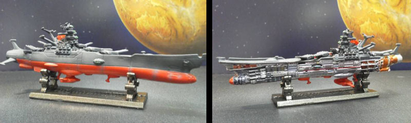
The most recent 3-dimensional cutaway view was this 2010 “DG” miniature from Bandai. DG stands for Digital Grade, a computer-controlled painting system developed by Bandai to bring an astonishing degree of precision detailing to miniature toys. Just over 4 inches long, the interior is almost as finely-crafted as a toy twice its size.
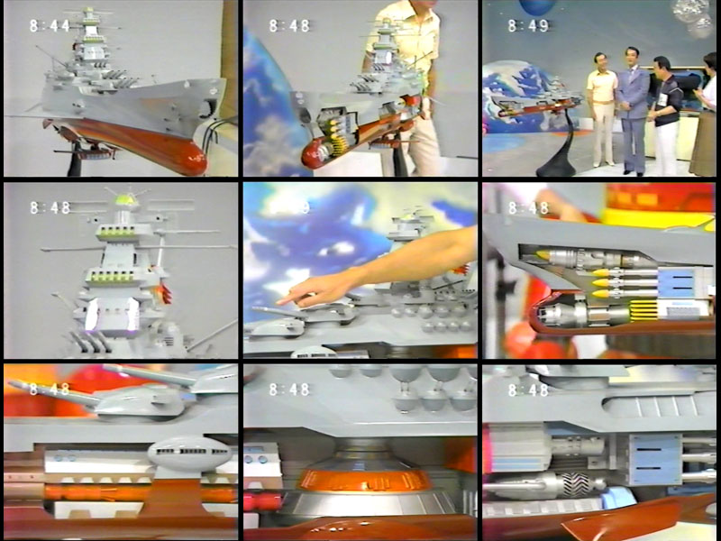
By far the most impressive three-dimensional rendering of Yamato is one that almost no one knows about outside Japan: an extremely limited edition (only two were made) 2-meter long “Precision Cut Model” that was specially commissioned by Office Academy for a traveling Yamato exhibit that began in 1978. Though completely intact when seen from its starboard side, the port side was left open to reveal the interior, larger than had ever been seen before or since.
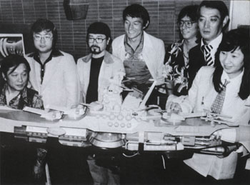
This model was the three-dimensional result of all the work done by Mori Art Design and was seen by thousands of people at anime festivals and special events. Shown below are stills from a Be Forever TV special in which Yoshinobu Nishizaki proudly displayed this masterpiece. (video courtesy Yamato superfan Steve Harrison.)
After the traveling exhibit closed down in 1983, one of the models was offered up in a charity auction that accompanied the 70mm re-release of Final Yamato (below left). The asking price was higher than anyone was willing to pay (about $80,000) so it remained in West Cape’s custody and made a few more public appearances in the 1980s. Eventually, it turned up again in an issue of Comic Gon magazine (below right) as a background prop in a 1998 interview with Leiji Matsumoto. But this was still not the end of its history. Click here to see where this amazing model went afterward.

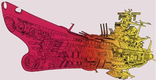
Taken as a body of work, the exterior and interior design of Yamato from 1974 all the way up to present is a unique expression of engineering in the service of pure creative passion. In a process like this, with so many artists pushing their craft to its limits, every aspect of the original idea was worked and reworked. The latest iteration’s close resemblance to the original serves as great testament to the care and skill that made possible everything in between.
the yamato is amazing