
Inside Message From Space
Tanaka: But now, since mecha of the 70s and 80s is being re-evaluated so much, I think it’s possible that you could work again. Design has taken a turn back to that time, and because it’s usually unknown territory for someone in their teens or twenties, it would be really fresh now. Manga from Japan has a big influence on foreign films. Also, Japanese manga was affected by Star Wars.
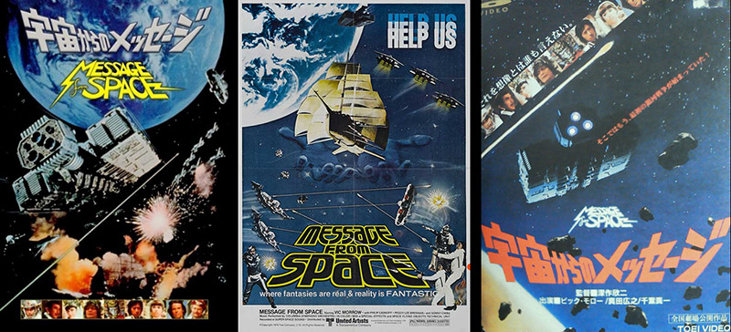
What I though was great in the days of Star Wars was, although small parts were stuck on the surface, the thing looks huge when you see it from a distance. When Star Wars became a hit in Japan, it would have been wonderful if great SF was made with space as the setting. Some movies were made, but it didn’t go very far. It was too bad. Around this time, Toei made Message from Space, Toho did The War in Space, and Star Wolf was done for TV a little later. Sayonara Jupiter came a little after that. It was the golden age of Japanese SF movies, so to speak. Wasn’t there also a Message From Space TV series?
Hio: It was Message From Space: the Galactic War. I put a lot of effort into making mecha, but it was kind of a waste for TV. I did make a lot of money from mecha.
Tanaka: The director was the late Kinji Fukasaku, and Hiroyuki Sanada had the lead role in the TV series. When I think about it now, it was quite an elite staff. The villain was the late Mikio Narita, and the grandmother was Hideyo Amamoto. Shinichi Chibi had the role of the prince, and Etsuko Shihomi appeared in it, too.

Hio: Once when I went to Uzumasa, Mr. Fukasaku was having a fight with [late Toei producer] Toru Hirayama. (Laughs) The scene had gotten really tense, and I was starting to feel like, “Should I be hanging around here?” They both grappled with each others’ opinions all night, and it was nerve-wracking…
Tanaka: Was there a disagreement between Director Fukasaku and Producer Hirayama? Did Director Fukasaku not actually want to do an SF film?
Hio: Mr. Fukasaku liked SF, but his opinions didn’t match Hirayama’s with regard to his favorite actors. In short, Mr. Hirayama had an image in his head that was different from Mr. Chiba. After all, where Mr. Chiba is concerned, it’s always too colorful. (Laughs) Maybe that’s because of Rainbow Modeling Group, who made the mecha. They’d made full-scale SF mecha props for Message from Space, and the word was that their work was several levels above the others.
Tanaka: Certainly the special effects in the Toei group were a step above compared to combining robots in a sentai series. [Translator’s note: this refers to the genre popularly known as “Power Rangers” in the US or Tokusatsu – special-effects TV shows – in Japan.] It set the standard for the time. After that, the genre of “SF space stuff” was established in Japanese tokusatsu.

Concept sketch for the Liabe fighter
So surely now, Pacific Rim is something that might have been made earlier in Japan. But to the contrary, a lot of that special-effects know-how has been lost, and people who can make something like that are very limited. The people who make the Toei sentai series have know-how, but to start now and make something brand new, there’s nothing to be done, because the handing down of special effects craft has been interrupted. Because CG can now be done easily.
Hio: That’s the cause.
Tanaka: With SF movies in Hollywood, they don’t make props any more. Almost everything is finished with CG. All the live-action shooting is just done in front of a blue screen. Did Message From Space use a blue screen?
Hio: Yes. Already, in those days.
Tanaka: But even today when you see mecha of Japan, it’s flying sailing ships and aircraft carriers. When I think about flying sailboats, Flying Phantom Ship was first created by [manga artist Shotaro] Ishinomori. A sailing ship looks good, so it’s easy to make it attractive.

Blue Noah
Hio: That’s right.
Tanaka: Well, Space Battleship Yamato had the battleship Yamato flying in space in those days…it makes a good looking picture.
Hio: And Mr. Nishizaki made Odin Space Sailor Starlight after that, too.
Tanaka: Oh, yeah. But in those days, everything Nishizaki made other than Yamato generally failed. (Laughs) Like Space Carrier Blue Noah.
Hio: I was called in for the planning on that.
Tanaka: Do you have anything to say about the manga adaptation of it?
Hio: I had something to say, but Sonorama told me “No!” (Laughs) And the editor said, “I don’t like you.”
Tanaka: Was that because you took so much time?
Hio: Yes. The editor in charge was the same as on Yamato. “My rise seems to have been hampered thanks to you.” (Laughs)
Tanaka: Yeah?! But Yamato sold, didn’t it?
Hio: Sure it did, but my artwork took too long. His road to in-house promotion was closed because of me, so the editing was handled by the chairman of the union.

Liabe fighter model kit
Akira Hio mecha design untold story
Tanaka: When you did mecha design for Message From Space, were you working at Ishimori Pro?
Hio: I wanted to do mecha design, and was summoned to Ishimori Pro in Shinjuku. Mr. Kato the manager and Toru Hirayama, then the producer of Toei, were there and told me what kind of mecha to draw. I didn’t know how many things I had to draw, so I went for 24 hours a day and it became grueling.
Tanaka: The gimmicks on the Liabe fighter were novel. The place where two fighters are linked.
Hio: In short, the order they placed was ridiculous. They’d be like, “What do you think if we did this?” (Everyone Laughs)
Tanaka: That’s right, huh?

Galaxy Runner and Comet Fire
Hio: At first I thought about the enemy fighters in various ways. I made the Galaxy Runner much later. I spent the whole first third of a month on it, and just couldn’t do it. I drew with three other people for 24 hours until I was exhausted. Finally, after we managed to get something we thought was cool, Mr. Hirayama looks at the design and goes, “Oh, this is nice,” Talk about trying to squeeze blood from a stone! (Everyone laughs)
Tanaka: You really went overboard with the movie props themselves. Did you have to do precise, triple-view drawings?

Governor’s battleship
Hio: That’s right. I did three orthographic views. I was told to make it like Star Wars or Battlestar Galactica. “Do an aircraft carrier,” and I said, eh? I didn’t think I could do it, but I had no choice. The governor’s battleship is based on a Leiji Matsumoto idea. It’s a three-stage carrier like the old days with two ships side by side and a battleship in the middle. The original image has that feeling.
Tanaka: There’s a Japanese style to that. In Star Wars, this sort of wedge-shaped battleship somehow just strikes a chord. I was into Shotaro Ishinomori in those days, and I recognized the work of Ishimori Pro, and at some point I was told, “This is an Akira Hio design.” And I knew exactly what they meant. I was like, “You don’t say?” It could be said that wasn’t Shotaro Ishinomori’s line work, but it’s a novel design even now.
Hio: You could call it novel. Or a jumbled mess. (Laughs)

Albegas, Laserion
Tanaka: No, no! There’s nothing like that in mecha design now. Transforming and combining mecha was followed up in anime like Lightspeed Electroid Albegas and Video Warrior Laserion. Were these designs based on a “this sort of concept” order from Bandai?
Hio: No, it was different. The original drawing was brought from Makoto Aoyagi from Ishimori Pro.
Tanaka: I’d also like to talk about Keiko Takemiya’s story, Toward the Terra. Was Myu’s cigar-shaped ship done in the image of a submarine?

Toward the Terra (English edition available from Vertical, Inc.)
Hio: That’s because it was simple. When I think about a form that’s easy to start with in a design, it’s definitely that one. I was busy when I worked on Toward the Terra. I really wanted to do more, but there wasn’t enough time. When work came from Keiko, I had to draw it and that made my own manga late. The editor cried.
Tanaka: I think mecha had a great presence in the SF works Ms. Takemiya created in those days. So even if it was time-consuming to write the mecha in, I think it was properly transmitted to the reader. Wasn’t all the mecha changed in the feature film version of Toward the Terra? By the way, you did all the mecha design for the Toward the Terra anime. [Feature film, 1980.]
Hio: That’s right. The purpose was to clarify the friends and foes in the anime. And so we went through a whole bunch of images.

Tanaka: The Myu mecha is like marine vessels.
Hio: That’s right. I went with an organic design, so it would look like mecha made by people of Earth.
Tanaka: There was no policy to retain the original?
Hio: In the end it was all changed. In the short running time of a movie, we had to come up with a certain degree of closure.
Tanaka: When the visuals are completely separate for friends and foes, there’s no misunderstanding for the viewer, or something like that. I’d say that the organic design with the shell is novel. Was there a policy to go in such a direction?
Hio: That was the intention of Director Hideo Onchi. I drew it while looking at an illustrated biology book. (Laughs)
Tanaka: He wasn’t an anime director, was he? There were many cases with very long scenes, which was a novelty. It was a movie where “Oh, that’s what can come from a person who isn’t an anime director!” Conversely, that’s how I came to understand how most shots in anime are very short. By the way, did you work on Toward the Terra after Farewell to Yamato?
Hio: Wasn’t it almost simultaneous?
Tanaka: That was incredibly hard wark. Doing the comic adaptation of Farewell while drawing Toward the Terra at the same time!
Hio: It was a barter trade. In other words, I could have Keiko fill in all the blacks on Yamato (Roars with laughter) It was that sort of feeling. For Keiko’s part, her attitude was basically, “You can do it if you want to.”

Tanaka: It was’t forgotten. The staff list for Ms. Takemiya’s Toward the Terra didn’t include the name Akira Hio. After all, that was a time when you were drawing only mecha, but even though your name wasn’t on it, I thought, “Oh, Akira Hio drew that.” Prior to Toward the Terra, men didn’t read manga by Keiko Takemiya, but that one brought Hio mecha into a girl’s manga. Other than being involved as a mecha artist, what did you think of Toward the Terra?
Hio: I had no particular feeling about it. I was a specialist, and for me it was more about trying various things technically, like putting in two or three layers of screen tone. (Laughs) In that aspect, I loved it.
Tanaka: Yeah, at the time you did both Yamato and Toward the Terra, you tried different things with them, didn’t you?
Hio: That’s right. I drew in color and practiced with an airbrush.
Tanaka: Another thing about the adaptations of Yamato is that there were no color pages. But you could experiment abundantly on various things, couldn’t you?

Cyborg 009 movie poster, 1980
A coating of analog and a coating of digital
Tanaka: Airbrush requires some technique, doesn’t it?
Hio: That was true at the time. But it can be done easily now.
Tanaka: Now that it’s digital, it can be easily redone.
Hio: It’s harder when you can’t redo it, because you can’t correct color ink.
Tanaka: Because the base line on a color page was drawn in color ink in those days, you only had one chance at it. At least you could correct black and white art if you made a mistake.
Hio: Speaking of color ink, at the time of the film adaptation for Cyborg 009, I drew all the posters at newspaper size (457 ×570mm). I was forced to redraw them about ten times.
Tanaka: You mean, Cyborg 009 Super Galaxy Legend?
Hio: Yes. The master [Shotaro Ishinomori] told me, “The feeling of transparency here isn’t enough.” He apparently wanted the image of the Seagull Nebula. It couldn’t be drawn easily. And every time I had to redraw it, it was at newspaper size. (Laughs)
Tanaka: (Laughs)
Hio: That took one full month. Somehow I did OK. Then I read in an anime magazine, “The teacher put on the pressure and it was redrawn ten times.” I said, “Hey, that’s me!” (Burst of laughter)
Tanaka: Is that so? If you’re just vaguely told to redraw it, that would be a problem, wouldn’t it? Wasn’t there some advice or a hint about how to redraw it?
Hio: I tried different paint ingredients and mixtures in various ways. Basically, the feeling of transparency is dependent upon the material. If you use a poster color-type paint, there is no transparency. But when you do it with color ink, corrections are very difficult.
Tanaka: In some places, it stands out. In others, it doesn’t. Did you eventually finish it in color ink?
Hio: Yes. This is the story of another job, but I was once hired by Dentsu to apply color to art by Seizo Watase to be shown in an exhibition. I had to apply color to a copy, but previous artists had tried it with poster paint and been rejected since it didn’t have that feeling of transparency. I had to paint it with color ink, and I finished about thirty sheets in one day. Watase had drawn it in black line and designated the color on the back.

Other art by Seizo Watase

Tanaka: The original was just linework because Mr. Watase designated the color for plate-making. The thing is, you can have no excuses at an exhibition, so he asked, “Could you please just paint it?”
Hio: Poster color gave it a completely different image, so I redid it. He’d given it to someone else to do, but the job came back to me.
Tanaka: Since you had already done such painting, you were known as someone who could work in color ink. Did you convert to digital drawing when Mac and Photoshop came out?
Hio: No, I didn’t. Yumiko Igarishi was the first to introduce it. Mr. Igashi adopted digital, then began teaching it to the pros.
Tanaka: As for people still painting in analog, I think artists over 50 tended to reject digital, whereas everyone below 30 embraced it. Since you can always redo, it never ends. There’s no clear landing point. In that respect, analog is a one-draw, one-shot deal. If you fail, you have to redraw from zero. It’s more like someone who plays hardball, and the tension of being hit by a real sword rather than a bamboo one.
Hio: In the past, the fee for an assistant was completely different when it came to color painting.
Tanaka: Even at Tezuka Pro, the work of painting artwork in watercolor was an assistant’s job. Did you get a color chart at Ishinomo Pro like the one at Tezuka Pro?
Hio: Our master didn’t comply with it. There were only two of us who could paint in color in those days, myself and Morihiko Ishikawa. Therefore, I stared into hell when the color pages increased. (Laughs)
Tanaka: Ah, because you were the only two people, you got all the work, huh? Did you use translucent or opaque watercolors?
Hio: It was the ordinary watercolor paint used in schools. After I went freelance, I began to use color inks and an airbrush when I got jobs doing posters and calendars.
Tanaka: I see. You got that kind of work, too.

Hand drawn doujinshi Three Drops of India Ink
Tanaka: Did you start at Ishimori Pro at the same time as Mitsuru Sugaya?
Hio: We worked on doujinshi together in high school.
Tanaka: I see. That sort of connection. Was it Three Drops of India Ink?
[Translator’s note: this name originated from A Drop of India Ink, a doujinshi by Shotaro Ishinomori, ten issues published from 1953 to 1960.]Hio: That’s right. A Drop was done by master Ishinomori, and Two Drops was done by two female manga artists, Yoshiko Nishitani and Kimie Shiga. So ours was Three Drops.
Tanaka: Was that a hand-drawn doujinshi?
Hio: That’s right.
Tanaka: Huh. When I once went to an art exhibition for master Ishinomori and master Tezuka, I was amazed to see a copy of A Drop of India Ink in a glass case. “This is – !!” At any rate, there was only one copy, so you couldn’t have sent it out in the mail to be read.

Gallery display of pages from “A Drop of India Ink” volume 2 by Shotaro Ishinomori
Hio: I saw it around the time I was in junior high and said, “I’m going to make one, too.”
Tanaka: Did you read the whole thing?
Hio: Yeah, it was great.
Tanaka: Did you letter all the characters by hand?
Hio: That’s right.
Tanaka: Who else contributed to Three Drops of India Ink at the time?
Hio: Yuji Hosoi, Mitsuru Sugaya, Akira Kawa… they didn’t turn pro after that, did they?
Tanaka: They still went on to be very famous. Yujui Hosoi drew for young children’s magazines, didn’t he?
Hio: That’s right. Isn’t he currently keeping up with Machiko Satonaka in teaching how to draw manga at Osaka University of Art?
Tanaka: And Akira Kawa drew for Special Edition Margaret and Wave of Iraka, right? She’s female, but goes by the male name “Akira.”

Akira Hio, 2014
Hio: It’s the same name as a character in the master’s story Chapter. Just with one character [letter] added. Same as me.
Tanaka: The “Akira” in Akira Hio is named after the character in Shotaro Ishinomori’s Chapter?
Hio: That’s right.
Tanaka: Personally, I thought Akira Kawa was a man. There were some men in those days who pretended to be women and drew girl’s manga. Like Ayumi Tachihara, right?
Hio: Leiji Matsumoto teamed up with Miyako Maki to draw for Monthly Margaret, too.
Tanaka: That’s right, huh? I understood that men would collaborate with women. In those days, even a man could draw for girl’s manga, right?
Hio: That’s right. Our master’s manga Sarutobi Ecchan was serialized in Weekly Margaret.
Tanaka: Tetsuya Chiba and Fujio Akatsuka drew for it, too. Manga artists drew in every genre.
Hio: That’s right.
Tanaka: The first time I met Leiji Matsumoto, I asked if he used a writing brush like a G Pen. And he answered, “No, a Kabura pen.” (See these drawing tools defined here.) And I was like, “Huh?!” Since then I understood well that it’s not the manga artist who decides the line, it’s determined by the pen.
Hio: That’s right. I started using a new pen under master Ishinomori, and to some extent I used that pen forever.
Tanaka: What pen did you decide to use?
Hio: I went with a Nichibun pen.

Tanaka: Ah! Nichibun pens are good, huh? Have you used that since the old days?
Hio: Yes. There was a time when the manufacturing process didn’t work because of environmental problems, so the quality dropped. The master didn’t use it after that either, and I said, “I don’t like that any more.”
Tanaka: These days, current manga artists are getting away from the Nichibun pen, aren’t they? Everywhere I go, there are only G pens, Maru pens, and Spoon pens. I use Nichibun pens, too, but it’s hard to get them.
Hio: There was a period when master Ishinomori bought several boxes of Maru pens from Zebra. If something is on the pen tip, it can completely ruin the quality.
Tanaka: A very high quality pen point was released recently. Made of titanium. There seems to be no shortage of titanium. (Laughs) With the final push into digital, pen-making companies have begun to make pens exclusively for manga artists, for the sake of their own survival. But sometimes it feels like it’s too late.

Shotaro Ishinomori manga pages
Comics expression is continuous invention
Tanaka: I think it may have been Gosaku Ota who came up with the idea to use that marble pattern that Ishinomori often used as a background.

Hio: Drawing with water.
Tanaka: Was it applied directly to the artwork, or done afterward?
Hio: It was applied directly. It was completely cut-and-paste. At first, they used it a lot, and used it well. You’d stir water in a sink and drip India ink into it, then stick paper to the surface of the water. It would be done in a few minutes.
Tanaka: In those days, Shotaro Ishinomori experimented with art in ways that other people didn’t.
Hio: It was often like that.
Tanaka: Did he invent the technique of sunlight slanting through leaves on trees? The light coming through the gaps. We now take that expression for granted, but someone had to start it.
Hio: At the time I started to draw, he used almost no screen tone. All lines were drawn with a ruler up until then. I brought it to him. When I was swamped, I asked to use it.
Tanaka: So when he started to use screen tone, it was because of you!
Hio: I used a lot of Instantex on The Way of Riyu. That was in the early days before I started shaving screen tone, so I drew over it in white. [Translator’s note: “Instantex” is a brand of adhesive screen tone. “Shaving” is a method of scraping the surface with a blade to create additional texture.] I did that for a while, then started to get good at shaving it. But when I tried it for the first time, I said “I shouldn’t be shaving it.”
Tanaka: The range of expression spread strongly after tone-shaving was invented.
Hio: Technology was necessary for that. You need a knife to shave the tone. It’s dependent upon the point of the blade not going bad. I used the back. When doing a large surface, I’d shave with the back of the blade.
Tanaka: No matter how many times I’ve tried that, I can’t get it to work. But now that it can be done easily with digital software like Comic Studio, I’m really grateful. I learned to use screentone around the time I saw Mr. Tezuka’s Black Jack and The Three-Eyed One. I’d apply it to a character’s hair.
Hiyo: Using a mesh to apply shadows wasn’t really done much. It was an unorthodox way to do it, but it was a mark of the atmosphere.
Tanaka: In the sixties, master Tezuka and master Ishinomori drew horizontal lines with a ruler to express darkness over everything. It also had a non-uniform taste. When I met Takeshi Ebihara (former assistant of Fujiko F. Fujio), who created Maicching Machiko-Sensei, he said “I filled in the blue part of Doraemon by drawing vertical lines while sticking on screen tone” and I asked why that was.
Doraemon had both color pages and monochrome pages, and it was done with vertical lines on the monochrome pages. When a color page was put in the same book, it became grey. So, I was told that since the sudden change looked odd, in the sections with the mesh you put in lines, and then stick on screen tone in the sections with the lines and it gives it a uniform look.

Hio: The degree of grey was adjusted.
Tanaka: It’s strange when the tone suddenly becomes a line in a book. But when I talk to people who have invented various methods, it’s fascinating to see how the history of manga and character expression has evolved.
So, thank you very much for today!
The End
Interview conducted November 11, 2014
Location: Café Andes, Nerima, Tokyo
Translated by Tim Eldred with support from Neil Nadelman
RELATED LINKS
Akira Hio profile at Manga Updates
Yamato Series 1 manga overview
Farewell to Yamato manga overview