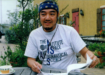
Without paying close attention to the talented artists who worked on Space Battleship Yamato from the beginning, it’s easy to overlook the fact that Leiji Matsumoto was not the only veteran who participated in the Playstation games. But one glance at the intricate mechanical designs quickly corrects that oversight. They are the work of Kazutake Miyatake, one of the most respected superstars of anime mecha.
As a charter member of Japan’s famous Studio Nue (the design powerhouse behind such anime classics as Crusher Joe, Macross, Gunbuster, and countless others), Miyatake was at ground zero in 1974 when the first TV series went into production and was one of just three artists who designed Yamato herself inside and out. His role expanded in 1978 on Farewell to Yamato when he almost single-handedly designed all the spaceships for the Earth and Comet Empire fleets. If you need one more credential, here it is: the Andromeda was largely his idea.
When the time came to adapt the mecha into the Playstation environment, there was no one more qualified than Miyatake to do the job. He went far beyond what anyone expected, upgrading and refining everything into sleek new forms that retained their original core. Even Yamato was re-imagined to such a degree that Miyatake’s new version later became the basis of Bandai’s massive 1/350 model kit, released in 2007.
And he didn’t stop there—he was front and center for the Playstation 2 games as well, taking things in ever bolder directions. Here are highlights of a lengthy interview with Miyatake that was published in the Fixed Data book for the second Playstation game (DNA Media Books, January 2001) in which he recounts what it was like to create anime’s greatest spaceships for both old times and new.
Yamato Must be as Good as the Old Days
Interviewer: What is the goal of a Yamato game for Playstation?
Miyatake: It must be as good for the fans as it was in the old days. The atmosphere is certainly different. The original should be unspoiled, but I wanted to improve some of the roughness of it. Because polygons make a three-dimensional object look different than normal freehand drawing, I thought it could bring a new sensibility to Yamato.
Specifically, it should show modern technology. So I added things like controls for electronic warfare and sensor countermeasures. To begin with, it is a projection of Matsumoto mecha. The sharper feel originates from Soviet fighter design. Matsumoto mecha inherits the coolness of that style.
Interviewer: In a way, it’s sad that people of the 20-year old ‘robot generation’ don’t understand things like that.
Miyatake: Indeed, the old Yamato designs may not suit the younger generation today. I thought about ways to adjust the focus of the image and imply more detail.
Interviewer: Your refinement of the Cosmo Tiger II from Farewell to Yamato is considerably stronger.
Miyatake: Yes. New technologies came to pass since the mid-70s, so the Cosmo Tiger II is now decidedely a stealth fighter. Even if the original design is somewhat changed, it is not unreasonable. Someone said I put a little Macross in it. (Laughs)
The economic life of a weapon is long, so some things last for 20 or 30 years, but a fighter needs to keep up with technology to be a state of the art machine. So I wanted to modernize it. The angles on it suppress the reflection of radar waves.
Because a game is drawn with polygons, the polyhedral design of stealth technology is very suitable; it’s difficult to express curved surfaces. We could keep the volume of data down while preserving the punch, so I took a bold plunge into stealth! I thought it would be effective, particularly in the case of a fast-moving fighter.
The Cosmo Zero design for Playstation also has a sense of stealth, and it’s especially apparent in the Black Tiger. We wanted to use triangles as much as possible to keep the number of polygons low. When I did the original design for animation, the stripes were often drawn incorrectly, but now it’s a texture attached to the surface of a polygon, so we no longer have that problem. That’s one of the ways it looks different.
Interviewer: What was the design point of the spaceships in Farewell to Yamato?
Miyatake: The balance of the main EDF battleship hasn’t changed much from the time of the movie, but the carrier changed considerably. It was adjusted a little for the Yamato 2 TV series, but I wasn’t involved with that. Originally, Matsumoto aircraft carriers were designed in a slab-like style, but this is more like the Minsk.
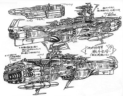
Interviewer: The Soviet Carrier? That was strangely gaudy.
Miyatake: But at the same time the bridge design was fairly simple. That was the first warship to use stealth technology. Bringing that to the Yamato PS game would give it the sense of a living thing. Sorry, I’m going back to the old days…
Interviewer: I think I understand. When a stealth machine like the B2 was drawn in SF anime, it looked like a parody in the time before the real thing appeared. Isn’t it hard to surpass both reality and the viewer’s imagination?
Miyatake: Yes. Yamato‘s original image had World War II as its base, so we didn’t mind reproducing scenes from old movies. A remake needs to be tailored for its time, but I couldn’t take away the nucleus of the original image when I modernized it. The curving, feminine silhouette of Yamato still has a strong visual impression, so it needs to keep that lineage even if the details are quite different.
If it has the Yamato name, it has to look like Yamato. If that’s still the case, then I have no problem if the game differs from the anime.
Interviewer: As long as the basic elements are the same…
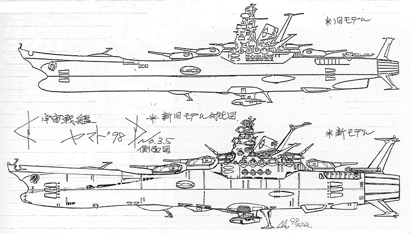
Miyatake: …that’s why I summarized the design the way I did. However, I couldn’t help making a chart to compare the original proportions with the new ones, and use it to pursuade others. Some said it didn’t change at all, other had the opposite reaction. It’s like the wind. (Laughs)
Interviewer: Were both reactions fair?
Miyatake: Both sides depend on the person’s point of view. The comparison was persuasive to both. My designer friends described the PS version as normal evolution. They said if you continued drawing Yamato for ten years or more, isn’t this what it would have become? I think that was a natural answer. Even though I changed it, it stayed the same, isn’t that how the saying goes?
I thought I would change the Andromeda, too, but I didn’t need to, other than making it slightly bigger and adding volume. Because anime is a 2-dimensional picture, it doesn’t have to be solid. The form of the ship can change without being incorrect. But a polygon has no choice but to be solid. 3-D animation can never be cheated, or the pieces don’t connect.
Honestly, nothing about the Andromeda changed much. It was not necessary. For the original, Mr. Matsumoto left 99% of the Andromeda to me, which means it’s done in the Matsumoto style and slightly in my style.
Interviewer: Did it take a lot of thought?
Miyatake: I regretted the EDF battleship (A). My first design didn’t have the punch it needed to emulate Yamato. I didn’t have enough technical knowledge at the time, and the drawing lacked personality. I felt this most keenly about the bridge. I asked Mr. Matsumoto about it, and he understood.
Interviewer: The Andromeda‘s bridge was redone many times back then, wasn’t it?
Miyatake: No, just once. Mr. Matsumoto drew a rough and I expanded on it. I added all the antennae.
Interviewer: How were the smaller EDF ships designed?
Miyatake: There was not a demand for them at first. In the beginning, there was only Kodai’s escort ship (B) [at the beginning of Farewell to Yamato]. The tubular body had only one ring-step around the engine. That basic form was scaled up and given two steps for the patrol cruiser (C). I thought it would need a lot of antennae, so I added more of them. I also used the escort ship as a base for the destroyer (D), decreased the armament and made the bridge lower.
I thought I would want to change them for the PS version of Farewell, but there was no need.
The Comet Empire city was James Blish’s New York
Interviewer: You also designed the enemy warships, didn’t you?
Miyatake: I did. I discussed them with Mr. Matsumoto to determine their function. We wanted to give a ‘compound eye’ look to their sensors and use a disc form that would clearly indicate a ‘space person’ made it. And I added a little more technology.
Instead of designing a clear top and bottom, I thought it would be a better idea to emphasize the technical differences by alternating the panels to build them up. That gave a chain structure to the ships of the Comet Empire.
Interviewer: That different approach to the enemy ships is similar to Macross. Is that how you approach such design?
Miyatake: When you determine the basic form of mecha, the details on the periphery become easier. So we start with a drawing that is like the shape of a car, a ship, or an aircraft. The process is very similar, but we draw it entirely on paper where they make mockups. In the case of automobiles, a full-scale wooden model was often made in the old days.
When you’re making something out of physical materials, the core of the idea increasingly changes over time. In the case of our EDF ships, the Andromeda, the escort ships, and all the others were developed to fill each other’s gaps. The details fit the needs of the soldiers inside the ships. But it is all based around the fundamental form.
Interviewer: Why does the new version of the Comet Empire City have channels in the lower hemisphere?
Miyatake: This was an order from the producer. He wanted to have trench warfare against heavy armaments. It would also give Kodai a clear direction into the mouth of the aircraft port.
The Comet Empire City was originally inspired by James Blish’s New York in the Cities in Flight series; it was built on a hemisphere of exposed rock. If you want to show another way of life, you add a different flavor.
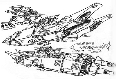
There’s also the Battleship Medaluza, which didn’t appear in Farewell to Yamato, it was in the Yamato 2 TV series. The [Magna] flame guns are a big, showy highlight. But I didn’t work on Yamato 2.
Interviewer: So you refined it this time?
Miyatake: The Medaluza comes from the Comet Empire, so their design is from a different worldview. I couldn’t change the parts that define the characteristics of the ship, so I just concentrated on the common areas.
But it was the Dreadnought that took the most effort. They said the original design would suffice, and there wasn’t enough time to do more than a single pass. The amount of linework on it is insane. (Laughs) It all has to be there to show how big it is. Even so, I doubled the number of guns and made it half again as long. In fact, the basic form was quite different from Mr. Matsumoto’s original rough. Plus, there was no model sheet of the underside in the old days.
Interviewer: Yamato is only about the size of its stern segment.
Miyatake: That’s right. But its bridge tower is about the same size as Yamato‘s. If you do things like that, the ship looks even bigger. I wanted to do more with it, but the deadline came. (Laughs)
Interviewer: If you have permission from the producer, an artist is cool with even fine detail.
Miyatake: Originally, Mr. Matsumoto came to me near the end of production on the movie. He was running out of time to design the Dreadnought, and the animators couldn’t finish their work without it. Everyone was screaming and tearing their hair out. That was often the situation in those days. So I was glad to have the chance to redo the design.
Interviewer: Even if it took over 20 years to accomplish.
Miyatake: Yes. But I have to offer my apologies to the game director. My first major task for the Farewell game was to rough out the Dreadnought, even though it doesn’t appear until the end. To only draw a front view was too limiting, we had to have the underside and rear as well. I finished them only after the schedule was extended first by three months and then four. It was a tough nut to crack.
I participated in Space Battleship Yamato in 1974!
Interviewer: The first work of yours I ever saw was an internal drawing of Mazinger Z when I was a student.
Miyatake: That wasn’t my first professional illustration; I did Kamen Rider‘s Hurricane Bike before that.
Interviewer: What was your participation in the first Yamato series?
Miyatake: I heard about it when it was still called Asteroid Ship, before it became Yamato. Takeshi Matsuzaki from Studio Nue was working on it as a scenario writer, so he took the lead.
Interviewer: Was he drawing for it, too?
Miyatake: Yes, as a designer. It was the two of us and also Naoyuki Katou and Haruka Takachiho. Previously we had made doujinshis of SF illustration as a group with Takeshi Matsuzaki as our chairman.
I was in graduate school at the time, so I didn’t work on it from the start, but I poked my head in and heard about how it was going. Matsuzaki spent all his time in the studio working on it.
Interviewer: What did you draw for it?
Miyatake: I only drew Yamato itself. Naoyuki Kato did, too. The model sheet of the stern view was his.
Interviewer: When I saw the TV series again recently, I was surprised at the impression of weight in the Yamato design.
Miyatake: The director, Noboru Ishiguro, was particularly conscious of that and I stuck to it. But it became more slender in the hands of some animators as the series went on. We had to take the bad with the good; it was a TV series, and all the pictures were drawn by many hands, so it was hard to preserve the sense of weight. But it is thoroughly reflected in the Playstation game. I think the width of the ship has broadened, too.
Interviewer: After all, Yamato really is big and heavy. It’s not just in the mind of the viewer.
Miyatake: Speaking of the old TV series…Part 1 and Farewell used different animation studios, so even the cel paint was different and the colors of Yamato were different.
Interviewer: It became more blue.
Miyatake: And lighter. With the old Yamato, the first color we tried was a heavy black, and some said it looked dirty. (Laughs) It looked dark and gloomy. It wasn’t a color for normal animation.
Interviewer: It was also framed differently in Leiji Matsumoto’s storyboards, with the pulse lasers and the glowing energy.
Miyatake: Those were done by Mr. Ishiguro. He had been making animation since his university days and he’d done research in effects animation at the time. He developed the space explosion that extended in all directions. Almost all the Yamato effects were by Mr. Ishiguro. He says now that he enjoyed it. However, because nobody else could do that kind of work, he kept pulling all-nighters and had to repair a lot of the animation by himself.
Interviewer: A supervisor did animation revision?
Miyatake: Yes. It was the only TV series where someone like him did so much mecha-related drawing.
Interviewer: Anyway, we have that heavy impression in the first TV series. It also had long scenes of space battles with no cutting back and forth. That sort of thing also made a strong impression.
Miyatake: Yamato was exceptional in those days of TV animation. The policy was “no recycling.” The voice from the top didn’t mind going over budget. There was no restriction on the cel count, although there wasn’t much time, either. The idea was to keep the stock footage down so every episode would look new.
Interviewer: There’s a famous story from back then about the ‘G’ cel.
[Editor’s note: on animation exposure sheets, the different cel layers are labeled by letter: A, B, C, etc. It is customary not to go deeper than a C layer, but some scenes in Yamato went all the way to an unheard-of G layer: 7 cels in a single exposure.]
Miyatake: Yes. The top layer was badly scratched. The cel material was bad in those days, and it wasn’t handled very carefully. The more cel layers they used, the less transparent and the more scratchy they became.
Also, the oil shock made things considerably painful.
Interviewer: Because a cel is a petroleum product.
Miyatake: There is a small amount in it. So even with a big budget you might not get enough cels. Between those shortages and the schedule, Yamato wasn’t easy to make.
Interviewer: By the end, even the top supervisor was in the trenches.
Miyatake: That’s how it was. I remember people saying Mr. Ishiguro should try to escape.
We had other problems, like the number of windows on Yamato‘s bridge. It really became a problem. The number often decreased. If you see it from an angle, there are a lot of lines to draw; the outer edges, the glass line, the inner edges. This was the reason the number sometimes dropped from five windows to four. It’s a little thing, but it piles up.
Interviewer: What about all those designs that covered several pieces of paper?
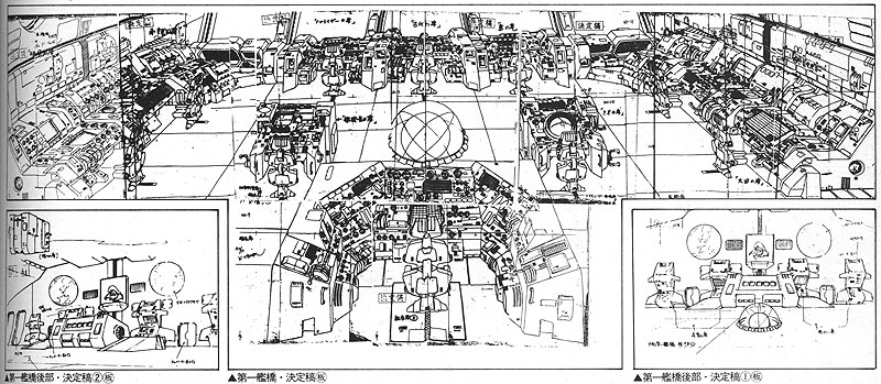
Miyatake: I tried to keep a design neatly on a single sheet, but when drawing something in perspective I often had to go off the edge somewhere; there’s a limit. I had to add an extension to find a point, otherwise the drawing might lose its power and realism. So I did it without worrying about using up paper.
But there was a problem in those days—copy machines didn’t have a reduction function. I had to draw large, it was unavoidable. Mr. Matsumoto didn’t understand this at the time either; some of his drawings took up 6 or 7 pages. (Laughs) I remember having a hard time cleaning up his roughs.
Now reduction is really simple, but in the old days there were few machines capable of it, so we had to find a blueprint machine.
Interviewer: In closing, I’d like to ask you about your future hopes. What do you want to do?
Miyatake: A sense of realism is the basis of our work. I was born in Yokosuka, and I grew up looking at military warships. American aircraft carriers made it their port of call…those provided the basics of my work so far.
But now I want to do exactly the opposite, and completely remove the realism. Take a plane, a battleship, or a spaceship–something from the Comet Empire or Gamilas, for example. The aim is to translate technology into a design, to give it a reality and a presence. That’s the sort of work that got me here and that’s what clients will ask of me from now on.
But I want to try and break that, to find something appealing in the opposite meaning. But I have no idea what kind of work it would lead to.
Interviewer: You want to break out of your shell.
Miyatake: That’s right. To create something fundamentally new, that’s the dream. Yamato has been that for over 20 years.
Interviewer: Thank you very much.
(Interview conducted in Yokosuka, June 10, 2000)
Read a 1992 interview with Miyatake about mecha design for Farewell to Yamato
See some of Miyatake’s work for the Playstation 2 games
Return to Playstation main article
Return to Yamato Games main article
Bonus: Miyatake’s published works
At left: World of SF Illustration/All of Studio Nue (64 pages, Asahi Sonorama, 1978): a compendium of Studio Nue’s early work for anime and other SF publishing. No Yamato art is included, but the huge variety of other art more than makes up for it.
At right: Kazutaka Miyatake Design Works (128 pages, Gentosha Comics, 2007): a smaller-format paperback covering Miyatake’s other anime work including Aura Battler Dunbine, Starship Troopers, Eureka Seven, and many more. ISBN978-4-344-80957-4
Left & center: Studio Nue Mechanic Design Books (194 pages each, Bandai, 1989, 1990): Volumes 6 and 9 in Bandai’s ‘Entertainment Bible’ series focused entirely on the work of Studio Nue from the very beginning. The books were organized by subject (robots, space battleships, aircraft, etc.) and included designs from Yamato. Part 1: ISBN4-89189-051-7. Part 2: ISBN4-89189-475-X
At right: Kazutaka Miyatake Design Works/Macross & Orguss (114 pages, Movic, 2005): a fantastic resource, particularly for Macross fans since it follows Miyatake’s work across many different installments of the Macross saga. ISBN4-89601-629-7
