
By Tim Eldred
One of the most interesting aspects of the Space Battleship Yamato saga is its evolution as a cultural phenomenon, which was the result of skillful intentions and some very lucky accidents. It came along at just the right time to influence and benefit from advances in animation techniques. It drew upon exactly the right talent needed to push it to its full dramatic potential. Despite a discouraging startup, it was perfectly positioned to make a comeback exactly when audiences were ready for it. These factors combine to make Yamato an ideal frame through which a pivotal period in anime history can be observed and measured.
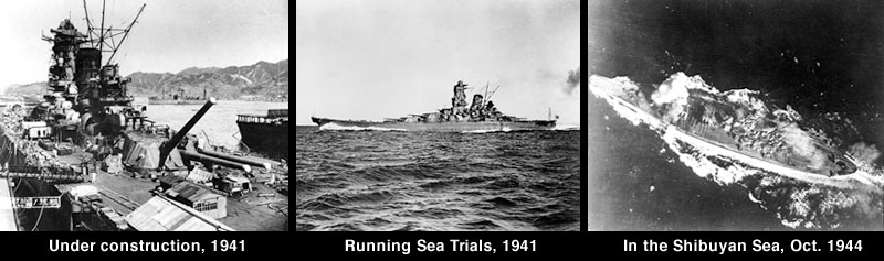
One way to do that is to examine the design evolution of the Yamato itself, which became every bit as recognizable as the Western world’s most famous fictional starship, the Enterprise. Founded upon the real-world battleship Yamato of the Imperial Japanese Navy, the animated Yamato is a majestic, idealized vessel made of equal parts form and function. The people of Japan placed so much hope and reverence upon the original Yamato that she came to be viewed as the physical embodiment of the nation’s fighting spirit, a classic case of the whole being greater than the sum of her parts.

(read more about the original Yamato here.)
It is a remarkable thing that such reverence could be so cleverly transformed into a benignly fictional manifestation almost 30 years later. It should surprise no one that the ship would become a character in its own right, subject to the same evolution and modification as any human character. As we will see, the spirit of Yamato refused to stay in a fixed form throughout the production years, and is just as alive today as it ever was.
Contrary to popular belief, it was not Leiji Matsumoto who suggested Yamato as the ship of choice for the story. That decision was made by producer Yoshinobu Nishizaki and his writing partners (Eiichi Yamamoto and Aritsune Toyota) the year before Matsumoto joined the staff as art director. During that year, ship’s design went through some “prehistoric” development. As Space Battleship Yamato emerged out of a premise called Asteroid Ship Icarus, the ship itself emerged out of a block of stone to become a fully-realized naval vessel in space. (Read our Yamato Origins series for all the details.)
Matsumoto’s arrival brought to the table a different artistic sensibility. He envisioned a longer, sleeker Yamato that abandoned traditional science-fiction flair (which was rooted in the art deco movement) for a more functional, nuts-and-bolts approach driven by his passion for World War II machinery. Another key turning point came from Aritsune Toyota’s invention of the wave-motion gun. Reconceiving Yamato as a single, gigantic weapon was the most critical step toward a design that would capture the imagination of millions.
It is the Matsumoto design that graced the cover of the very first Yamato publication, a limited-edition presentation book which, combined with a pilot film, gave prospective broadcasters a taste of what was to come. On the strength of this presentation, the Yomiuri television network gave Yamato a green light for the fall season of 1974. This artwork also became the de facto style guide for early merchandising. Bandai, an up-and-coming model kit manufacturer, used it as the basis for the first Yamato model kit and the box art that accompanied it.
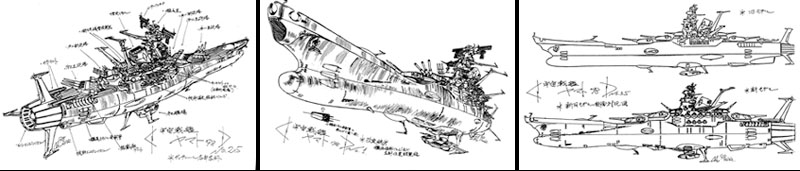
At this point, the path of Yamato design branched into separate routes. The first was occupied by animators who would now have to draw the ship from every conceivable angle. Some of this work had previously been done for the animated pilot film, in which the design had already begun to evolve on its own. Now that a larger number of artists were involved, it was necessary to lock that design down into comprehensive model sheets that could be accurately interpreted. An isometric plan for the ship was the most obvious approach, but an early decision made by animation director Noboru Ishiguro would lead to a pivotal discovery.
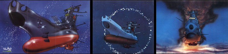
Ishiguro wanted the ship to have a convincing sense of scale, which he didn’t think would come across in lightning-fast flyby scenes. So instead he opted for slower, more majestic ones with a high cel count. (The economic tradeoff was that such scenes could be used multiple times throughout the series.) Everyone who has seen the anime knows the most memorable scene that resulted from this decision: Yamato starts as a tiny point, flies toward the camera in a 3/4 view, passes close by, then recedes away into another tiny point.
For the first time, the visual emphasis was placed on the bow, warping and cheating the isometrics in favor of pure drama. Without knowing it, Ishiguro had created a permanent dilemma. The isometric drawings had great technical appeal and the 3/4 angle had great aesthetic appeal, but the two could not be reconciled in three dimensions. Toy and model manufacturers would be struggling with that very issue for years to come. Ishiguro’s knack for dramatic angles was also demonstrated by his launch scene in episode 3, which would go on to become one of the saga’s most enduring images.
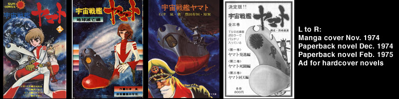
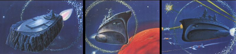
The second design path was the domain of licensors who were preparing Yamato tie-in products as the animators were scrambling to get the show ready. Since almost no reusable animated images had been created yet, a licensor’s only option was to create their own artwork using the limited references at their disposal. One of the most important “early adopters” was Asahi Sonorama, the first publisher of tie-in manga, children’s books, and novelizations. Their early efforts (shown above) demonstrate the tendency of artists to redress a lack of hard reference with their own sensibilities, placing different emphasis on parts of a design and turning out wildly variant versions of a single “starter image.”
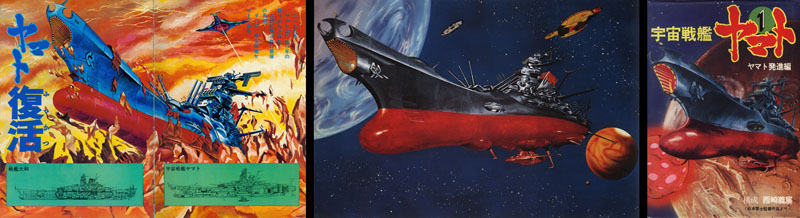
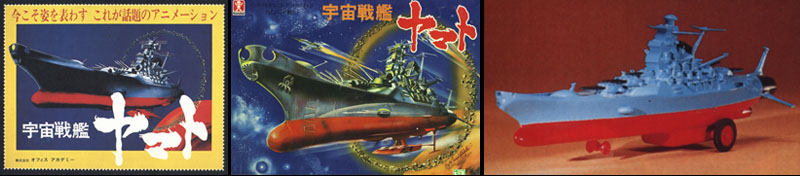
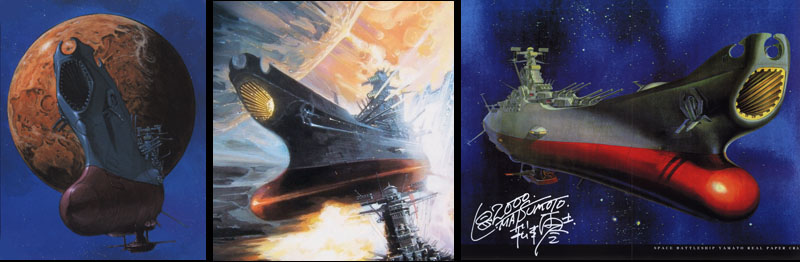
In the case of their first children’s book, Sonorama was able to commission artwork from a gang of insiders: Studio Nue, who contributed mecha designs to the TV series and would later do the same for Farewell to Yamato. They added their own creative flair, reshaping the hull into an almost sharklike silhouette. When the time came to create promotional artwork for the Space Battleship Yamato movie in 1977, studio member Naoyuki Katoh evolved this variant into a painting for one of the film’s posters. Interestingly, it became the basis for a cover painting on Sonorama’s next novelization, which helped to further establish the “Katoh Yamato” as a legitimate variation.
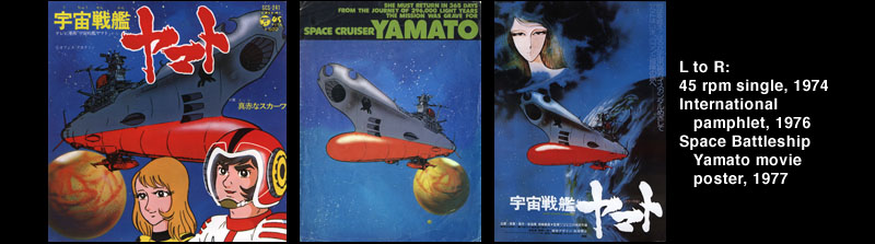
But by far the image with the most visibility in 1977 was one that had appeared three years earlier on Nippon Columbia’s first Yamato 45rpm single, a drawing straight out of the animation unit that perfectly depicted the mass and power of the ship. The piece was used only by Nippon Columbia until 1976, when it was repurposed to promote the English-language version of the Yamato movie to international audiences. It was a simple matter to maintain it as the signature poster-image for the Japanese edition and thus establish it as the definitive “first-generation” Yamato.
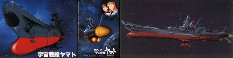
It’s no exaggeration to state that everything changed in 1978 with the release of Farewell to Yamato to movie theatres. In a word, it was a blockbuster, only the second of its kind in Japan (with the Space Battleship Yamato movie being the first). Now that Yamato was a household name, the sequel would benefit from a larger budget, access to a higher standard of animation at Toei Studio, and (most importantly for the topic at hand) much greater quality control over the use of images.
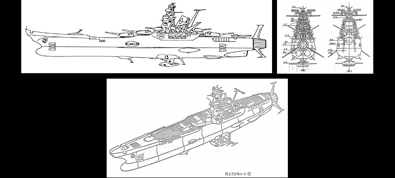
The haphazard licensing practices of the past were eliminated at a stroke with the establishment of two key images that set a new standard for Yamato’s design; a 3/4 front view and a 3/4 rear view (the latter painted by storyboard artist Yasuhiko Yoshikazu,
who would later go on to a multi-faceted career of his own). Fittingly, both images were derived from Ishiguro’s flyby scene, which had since become a dramatic icon. Bandai commissioned fresh box art for its new model kits in 1978, including a pristine new painting of Yamato in profile, based directly on the isometric design from the TV series. These three images became ubiquitous, appearing on all manner of Yamato products in one of the earliest and most successful “branding” campaigns in anime history.
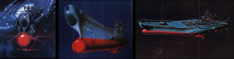
The standard would be raised yet again in 1980 with the release of Be Forever Yamato. Lessons learned from the successful marketing of Farewell were amped up and redoubled for this new film, which was as remarkable for its promotional campaign as it was for its dramatic content. A story point was made of the ship itself getting an overhaul, and the primary images reflected this. Quality control reached its peak on Be Forever, with promotional paintings emerging directly out of Toei’s animation unit, sometimes using the exact same art as the film itself. The most common image, a bow-on angle, was a direct echo of Ishiguro’s famous launch scene from series 1. Two more included a newly-refined 3/4 view and a down-view of the deck. All were rendered in an appealing airbrush technique by art director Geki Katsumata, who would become the go-to guy for all manner of product and publicity art in subsequent years. These and many more images were a precise match to the style of the film, which now embodied the state of the art in Japanese animation.
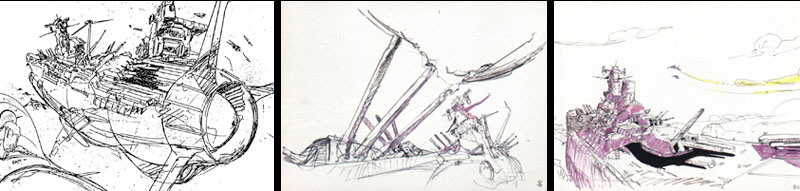
Be Forever gave way to Yamato III, which gave way to a long development phase for Final Yamato. For most of 1981 and all of 1982, multiple paths were explored in both story and design to ensure that nothing would be left undiscovered. Animator Yoshinori Kanada, who had added a fresh and dynamic style of animation to recent productions, was given free reign to sketch Yamato (and anything else he wanted) from unusual and unexplored angles. From this simple design brief, he produced dozens of new drawings to inspire the animators. (Read our tribute to Kanada here.)
Geki Katsumata and other artists took it from there, borrowing on Kanada’s unique sense of depth and mass to produce an extensive series of paintings that seemed barely able to contain a Yamato that had grown far beyond its origins into the realm of living mythology.
With the production years now in the past, there was little need to continue refining and developing the Yamato design. With continuous access to a huge library of images, product licensors had only occasionally to commission new artwork, with the rendering styles of individual artists breathing continuous life into the saga.
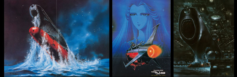
In the late 1990s, Leiji Matsumoto returned to preside over a Yamato revival between the 20th and 25th anniversaries of the original series. Chief among his new projects was to consult on a series of Playstation games produced by Bandai from 1998 to 2005. Seeing this as an opportunity for a fresh start, Bandai asked one of Matsumoto’s old friends from Studio Nue to re-imagine the classic space battleship for a new medium: CG animation.
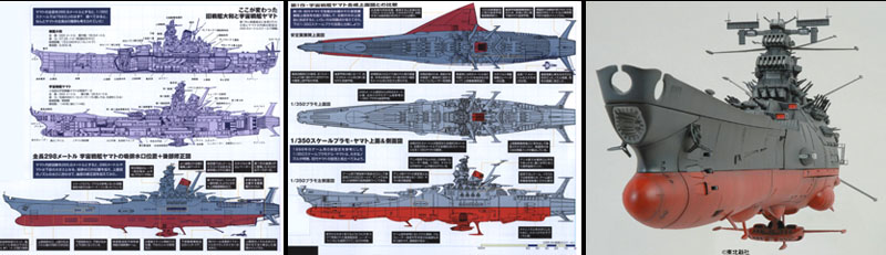
Kazutaka Miyatake was a founding member of Studio Nue and had a hand creating the sharklike Yamato that had emerged in the 1970s. He had also worked closely with Matsumoto to design most of the spaceships for Farewell to Yamato (including the Andromeda) and then moved on to a prolific career of his own, designing mecha for well-known anime productions such as Orguss, Starship Troopers, and every single iteration of the Macross saga. Miyatake broke ground on the Playstation project by adding more detail and texture to the “Katoh” Yamato, reshaping and remodeling it as he saw fit. He then proceeded to do the same with every other spaceship to be seen in the games, which would go all the way through Be Forever Yamato. Shortly thereafter, his revamped Yamato served as the blueprint for Bandai’s most ambitious model of them all: the massive 1/350 kit that was released in early 2007. (Read an interview with Miyatake here)
Even this is far from the last Yamato. One of history’s lessons is that a good story can endure through many different retellings. It’s in the nature of a compelling idea to be revived whenever a new generation hungers for a symbol in which to place their hopes and dreams. It’s natural for that symbol to evolve over time in order to reach a new audience. As long the need exists for strong and meaningful stories, Yamato will endure.
Hi
I love this drawings,
Where can find it,as a book maybe?
Thanks
Nicolas
These images come from several different books and other sources. You will need to collect a lot of things to find them all. (Good luck!)